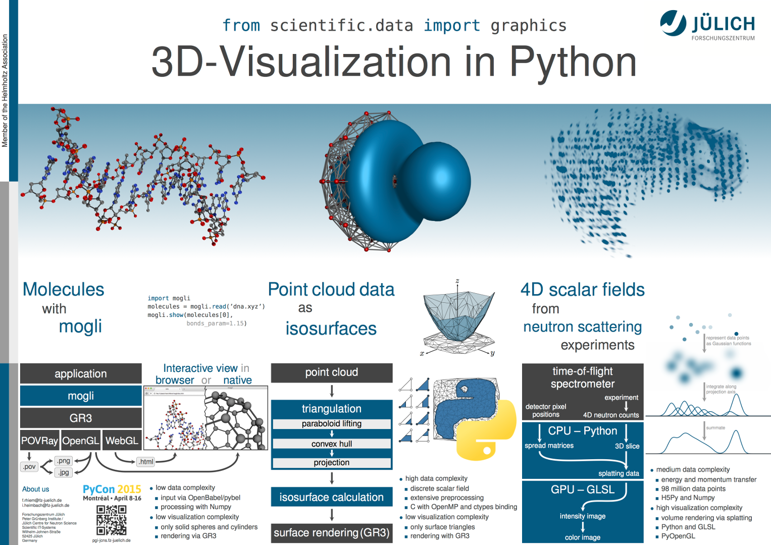
Increasing amounts of data have made graphical representations essential to the analysis of scientific simulations and experiments. Although there is presently no universal and efficient tool for three-dimensional data, Python is capable of scientific visualization. In this poster session, we present three applications, ranging from simple ball-and-stick molecules to complex volume rendering.

Abstract
Scientific simulations and experiments often generate results that can only be interpreted with the help of computer graphics. Even though Python packages do exist for three- or higher-dimensional data visualization, they are either limited to specialized applications or too general and thus inefficient.
In this poster session we present three applications that demonstrate the visualization capabilities of python and show why problems of different types require different approaches. Since still images cannot fully represent interactive applications, the poster will be accompanied by live demonstrations.
The visualization of molecules is a common problem and involves neither complex data preprocessing nor elaborate graphics. Based on GR3 and the GR framework, mogli serves as an example of the typical ball-and-stick representations. These can be achieved with existing tools, and developing an end user application requires comparatively little effort.
However, this is not the case for the visualization of Fermi surfaces, atomic orbitals, and other implicit functions defined on unstructured point sets. The resulting surfaces can easily be rendered, but their computation from raw data requires complex and time-consuming algorithms.
In analyzing neutron scattering experiments, we do not focus on the rather simple data preprocessing, but on volume rendering. Despite millions of rendered data points, acceptable frame rates can be achieved by utilizing modern graphics hardware.
Demos
mogli: WebGL export
If your browser supports WebGL, the canvas above should show a 3D rendering of a DNA molecule. Use your mouse or touchscreen to rotate the molecule! The HTML and JavaScript code for this was created using mogli and the following script:
import mogli

molecules = mogli.read('examples/dna.xyz')
mogli.BOND_RADIUS = 0.05
mogli.export(molecules[0], 'dna.html', width=1280, height=720,
             bonds_param=1.15, camera=((40, 0, 0),
                                       (0, 0, 0),
                                       (0, 1, 0)))
isosurface "Python": video
A two-dimensional function whose values are only known on a finite set of points is to be visualized focusing on a given threshold, the “isovalue”. The video shows the approximation of the area in which this function is greater than the isovalue. Its border is called “isoline” and is therefore defined by the implicit function:
Steps of isoline generation:
Point transformation (0:00 - 0:05):
The point set is transformed into three-dimensional space by introducing a z component defined as:
z = x2 + y2As a result, the point set is "lifted" onto a paraboloid.
Convex hull computation (0:05 - 0:19):
The convex hull of the transformed point set is determined. For that, the quickhull algorithm is used, which calculates the hull in an iterative process. It starts with a tetrahedron as first approximation and incrementally adds one point at a time until the convex hull is found.
Hull triangles which are not part of the paraboloid’s surface (forming a roof) are not shown, as they are not needed past this step.
Projection (0:19 - 0:21):
By removing the z component again, basically “squashing” the hull onto the xy-plane, the triangles forming the convex hull are transformed into a Delaunay triangulation of the original point set. These two-dimensional triangles connect the points, filling the area between them, in a suitable way for calculating isolines. Their comparatively short edges are advantageous for linear interpolation in the final step.
Isoline calculation (0:21 - 0:38):
If the function is not uniformly greater than or less than the isovalue at the corners of a triangle, an isoline segment runs through the triangle. The end points of this segment are approximated using linear interpolation.
To show the algorithm at work, the area enclosed by the isoline is colored, as each triangle is processed.
qevis: video
This video shows a 360° rotation of data from a neutron scattering experiment. It is a 3D slice from the original 4D data and the colormap on the right was used to render the intensity image.
Contact
If you have questions about the topic, simply send an email to Ingo Meyer or Florian Rhiem.
